In AI era UI feels more static than it can be
One thing I’ve been thinking about lately: in the AI wave, UI/UX seem disproportionately unchanged.
We became very good at building intelligence behind the interface. Recommendation systems decide what content to rank, machine learning predicts intent, big data gives us more context about user behavior, and LLMs are becoming increasingly good at summarizing information and making decisions based on context.
At the same time, I feel we still build interfaces in mostly the same way.
We define components, screens and navigation. We fetch data and fill those components with it. We can make composition backend-driven, change the order of modules, hide some of them, or show different variants for different users, but the underlying structure is still mostly crystallized in advance.
In other words, we are getting much better at deciding what data to show, but not necessarily at changing the way the interface itself responds to the current situation.
That made me think that maybe we could share more context for users around the data and not only data itself.
Instead of asking which predefined component should be rendered, an on-device model could look at the current context and decide what is actually important for the user at this moment.
It could suggest an action, provide additional context or decide that there is nothing particularly important to show.
A shopping app
Normally you would see some combination of recommendations, promotions, recently viewed products, categories, orders and other predefined parts of the home screen.
But perhaps what is actually useful is the context around what has happened since the last time you checked the app: price changes, promotions, or a new product that might be interesting. It shouldn’t be another normal banner, just context.
For example, nothing else has significantly changed since your last visit, but today the price dropped by 30% for that particular SSD you looked at.
Instead of presenting the usual home screen and expecting you to notice this somewhere inside it, the application could simply say:
The 8TB SSD you have been looking at is now 30% cheaper. Want to check it out?
The backend would still remain the source of truth. It could expose the current state, relevant events and available capabilities. The local model would interpret this information together with the user’s context and decide what deserves attention.
The interaction could look like this:
"Give me the relevant context for this user."

Backend:
- Product A viewed 7 times during the last 3 weeks
- Product A price dropped by 30%
- Two active orders, no status changes
- No account issues
- No other significant events

Available actions:
- Open product
- Add to cart
- Buy
- Dismiss

Local model:
"The price drop is the only meaningful change.
Surface it and offer the product as the primary action."
The important part here is that the model is not generating an arbitrary interface. It is deciding what deserves the user’s attention.
The UI can still be native, deterministic and built from normal components. What changes is the decision about what should appear in front of the user in the first place.
The same idea can apply not only to what the interface shows, but also to how much of it it shows.
Another interaction I find interesting is using the local model to control the level of detail.
Today we usually decide in advance how much information a component contains. Maybe there is a short description, a “read more” button, and a separate details screen.
But if the interface is built around context, the amount of information does not necessarily need to be fixed.
A mail app example
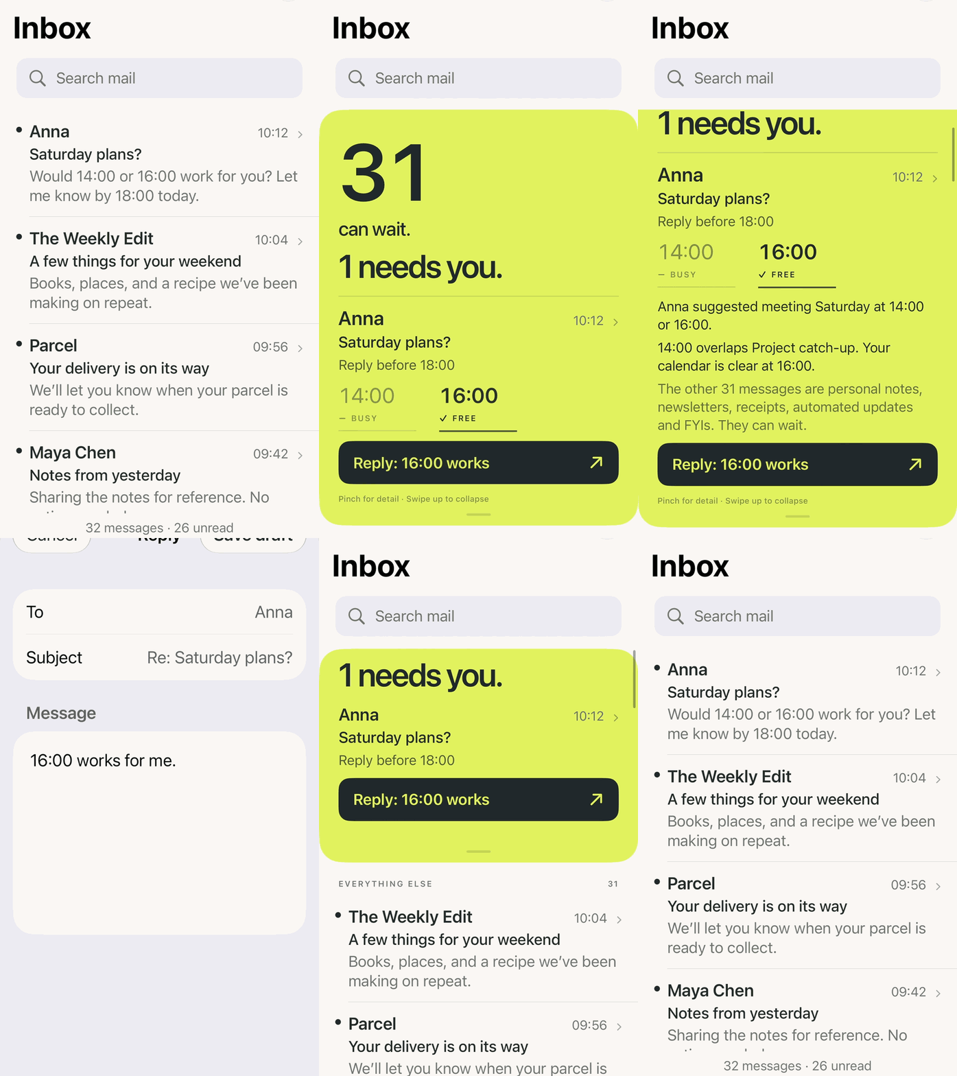
Normally it shows the inbox and leaves it to the user to understand what is important. But the local model could look at the messages together with other available context and decide that 31 messages can wait and only one needs attention.
In this example Anna is asking to confirm plans for Saturday before 18:00. She suggested 14:00 or 16:00. The model can also see the local calendar context and knows that 14:00 is busy while 16:00 is free.
Instead of just highlighting the email, the interface can provide the context and already suggest an action: “31 can wait. 1 needs you”.
This is not just summarization! The interface takes information from different contexts and changes its hierarchy around what is important right now.
A banking app example
Let’s say you are opening the app with €4,862 available. There is nothing unusual happening, but an annual insurance payment of €1,248 is scheduled for tomorrow.
A normal banking app can show the scheduled payment somewhere in the transaction list.
But the more useful context might be: “€4,862 available now. After tomorrow’s insurance payment: €3,614”.
The model is not only showing the event, but explaining what this event means for the current state of the account with a dynamic level of detail.
The gesture is changing the semantic resolution.
The application already has the underlying facts. The local model can decide how to explain those facts at different levels of detail while keeping the same context and available actions.
In that sense, information density itself becomes part of the interface.